Why Classicism Never Goes Out of Style
Hellenistic Revival? Roman Retro? Classical décor is making a comeback. But the truth is, it never really left.
Flowering Fragments by Richard Yasmine hint at the future of classicism.
In December, Pintrest released its annual Pintrest Predicts 2022 report that names some of the hot new trends for the year ahead. Though search data can be a great tool for identifying emerging trends, I often find that by the time these signals show up on Pintrest’s radar, they are hardly emerging anymore. This is why I find it so hard to believe that the inaccurately named Hellenistic Revival is a trend no one saw coming. In truth, classicism is the one style that never really dies.
Oh Helen, We Hardly Knew Ye
First, what exactly is Hellenistic Revival? Well, according to Pintrest, the trend “take[s] inspiration from ancient Greece and invest[s] in everything from Corinthian home décor to Aphrodite-inspired wallpaper.” In short, classicism. And not just any classical tradition, but specifically Greek classicism. And herein I have a problem.
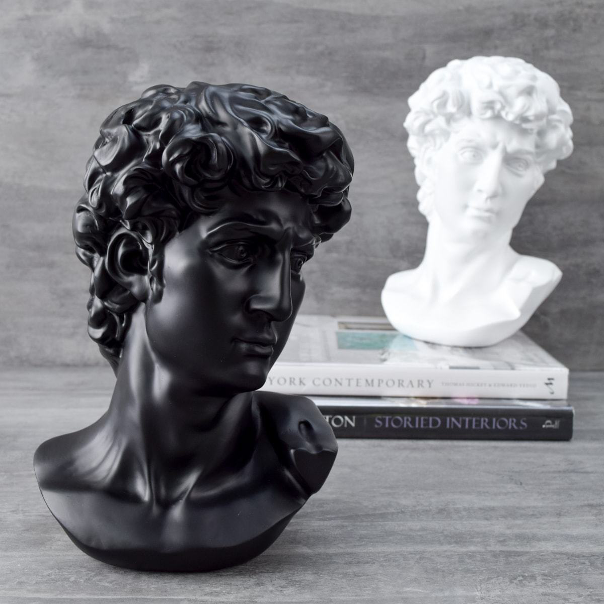
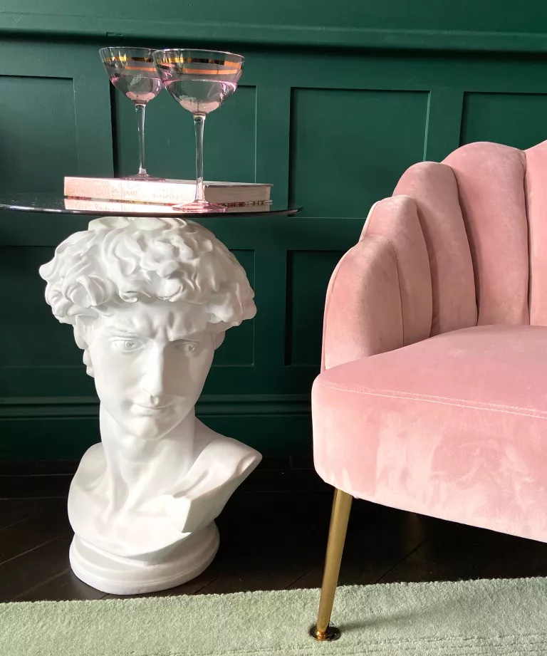
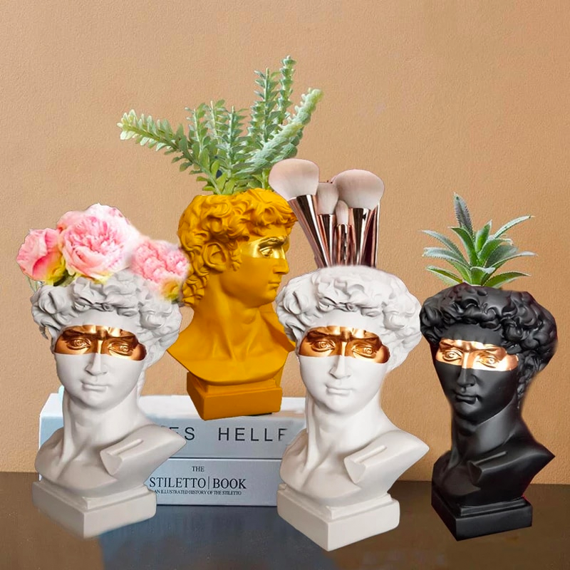
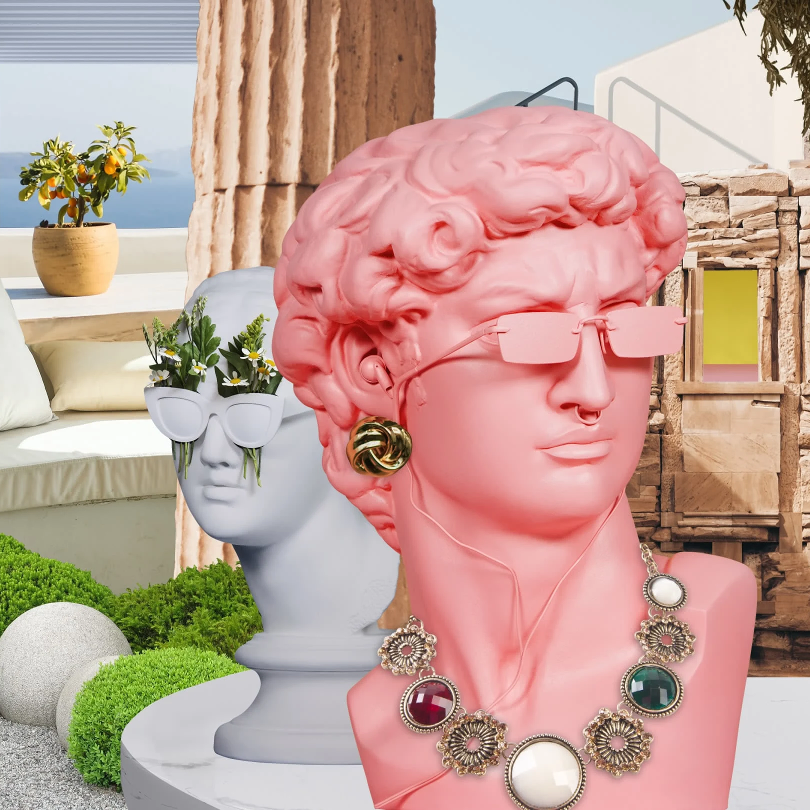
What I find most humorous about the name Hellenistic Revival is how many headlines I see that include it alongside busts of David. Now, I realize that I am an art history geek, but I don’t think it’s too much to ask for editors to know that the statue’s carver, Michelangelo, is an Italian Renaissance artist—neither Hellenistic nor ancient by any historical standards. Yet I continue to see (and be amused by) David’s turned head sporting everything from sunnies to floral arrangements, all under the guise of some kind of hedonistic Hellenism we’re experiencing.
I get why David, with his white marble skin, can be thought of in the same category as the ancient Caryatids. But alas, I continue to see a mix of classic faces, generic column fragments, and clunky gold jewelry that looks more Versace than any Winged Victory. Perhaps the one truly Greek element is the abundant presence of the Greek key motif that is now adorning everything from pillows and bedspreads to porcelain and plates. While this Hellenist hill is not one I intend to die upon, I can still refuse to partake. Henceforth, I will refer to this trend as the classic revival that it is.
Walking In Memphis
If you think classicism has snuck up on us, you haven’t been paying attention. The past few years we’ve seen loads of arches, flutes, and columns in everything from furniture and lighting to wall treatments and mirrors. Many times, these elements are done with exaggerated colors and proportions ala post modernism. Though this perhaps explains why we have associated these elements with the Memphis Group rather than the ancients, it is important to remember that postmodern designers chose these historical motifs for a reason.
Post modernists rejected the anti-historicism of modernism. Rather, they embraced historical references, employing them on their own terms. Exaggerating these elements allowed them to express an irreverent attitude toward a history that had long seemed sacrosanct. In their hands, terrazzo became a pattern, fluted columns became squiggles and parallel lines, and capitals became chairs, buildings, and just about everything else. Ancient elements weren’t the only historical references postmodernists distorted, but they were certainly a favorite. So much so that a small group of plucky Italian architects and designers named themselves after the ancient Egyptian capital and the Bob Dylan song “Stuck Inside of Mobile with the Memphis Blues Again;” the name Memphis perfectly embodied the blending of past and present to create something uniquely new.
Return to Order
Postmodernism wasn’t the first-time designers took inspiration from classical elements, but it was distinct in how designers chose to use them. While other eras interpreted the ancients through specific forms and motifs, they rarely veered from the proportions of the golden ratio. In contrast, postmodernists mocked these rules of order and symmetry, enlarging legs, compressing scrolls, and distorting traditional forms.
But indeed, to the golden ratio we will always return. Found in nature and known mathematically as the Fibonacci Sequence, the ratio 1.618 is hardwired into us. It is the sequence we see in nautilus shells, galactic spirals, and even DNA molecules. Scientists have even discovered that faces matching this sequence are found to be more attractive. If nature can’t diverge from it, how could we?
Our return to classicism marks our need for balance and order. It acts as a palette refresher to the chaos we’ve felt for the past few years. Further, classicism strikes against our romanticized tendencies toward emotions. It is clean and rational, not dramatized or layered.
As this style continues to mature, I predict it will become more nuanced and sophisticated. Romanticism and classicism will find new ways to co-exist—fewer faux marble busts and more re-imagined pieces like the work of Richard Yasmine. In 2021, Yasmine released his Flowing Fragments series which pays homage to ancient traditions. Starting with a classic capital, Yasmine reduced the shape to basic geometric forms. The result links to the past but also to the present.
This is the classicism of the future.
